The Annex Residents' Association - Casestudy
What is The Annex Residents' Association?
The Annex Residents’ Association has been serving the people of the Annex neighbourhood in Toronto, Canada since 1925. It is a volunteer organization committed to improving and preserving the distinctive character of The Annex neighbourhood and its heritage properties, to create welcoming green spaces and parks, and to foster a strong community spirit. The strength of The Annex Residents' Association depends on its base of support in a well-informed community.
The Project
Create a new brand identity to establish a cohesive and recognizable voice across all communication channels
Research suitable platforms to host the website, manage memberships and write newsletters
Build a new website based on the new identity
Migrate the existing website content and memberships to the new platform
Challenges
Design
Designing a new brand identity (or updating one) is always met with some resistance because people feel connected to, and protective of what they currently have, even though it might not serve the organization's goals anymore because it is outdated or stale or not in line with new goals and strategies.
Convince the stakeholders in the organization of the benefits of the new identity. The new brand indentity must align with the organizations values and goals and must be welcoming to all existing and prospective members.
Technical
Find a platform that is user-friendly to both the non-tech-savvy members who will administer the website and the visitors of the website. Because of the small budget of the organization platform choices are limited.
Solutions
Brand identity design
The old identity was not well designed, lacked personality in its typography and the implementation across their different channels was not refined nor consistent.
The old logo and identity showing inconsistencies
After researching the current logo and identity, the organization's history, and talking to the Board members about the organization's goals I had enough information to start sketching new ideas. For the redesign I decided to keep the main idea of using a house or house elements as the icon of the logo. The Bay & Gable heritage house are a much loved and very recognizable feature in the neighbourhood and a house symbolizes the binding factor that all the residents have in common.

Logo sketches
Final 2 logo versions presented to the Board members. After a vote version 1 was chosen.
For the wordmark I choose to use the award-winning Verlag, a typeface originally designed for the Guggenheim Museum. This typeface blends classic and modern type design which fits the organization well; a nod to its rich history but decidedly in the present and forward-looking as well. An additional aspect of Verlag that makes it a fitting choice is the pointy 'A's; they resemble the shape of the steep Bay & Gable roofs.
New logo. A depiction of a typical Bay & Gable heritage house is used as the icon of the logo. The wordmark is set in Verlag.
Logo presentation video, april 2021

House icon with unlimited variations in elements and colors possible. To be used for different applications such as illustrations on website, banners, social media, etc.
Color scheme
For the main brand color green is used. Green is the color of the old identity and will help with keeping the identity familiar. I updated the green to be a bit 'fresher.'
Additional colors are chosen from colors that are found in the neighbourhood itself; the color of bricks, roofs, window trim colors and slate roofs.

Colours in the neighbourhood
Platform analysis
For The Annex Residents' Association it was important that their platform would fullfill a number of requirements. It needs to be easy to use for both administrators as well as website visitors. Ideally it would be able to handle all communication channels (website, newsletter, direct emails, events & campaigns) and have integrated membership management and payment processing.
I researched a number of options, narrowed it down to the most promising and presented these options to the Board during a meeting. After extensive deliberations we decided on migrating to NationBuilder.

Platform comparison overview
Website design and content migration
After the platform choice was made I set out to design a custom theme for the NationBuilder platform based on the new identity.
For the content and memberships data I initiated a migration plan that is currently being rolled out.
New website release is scheduled for July, including updating all social media channels with the new identity materials.
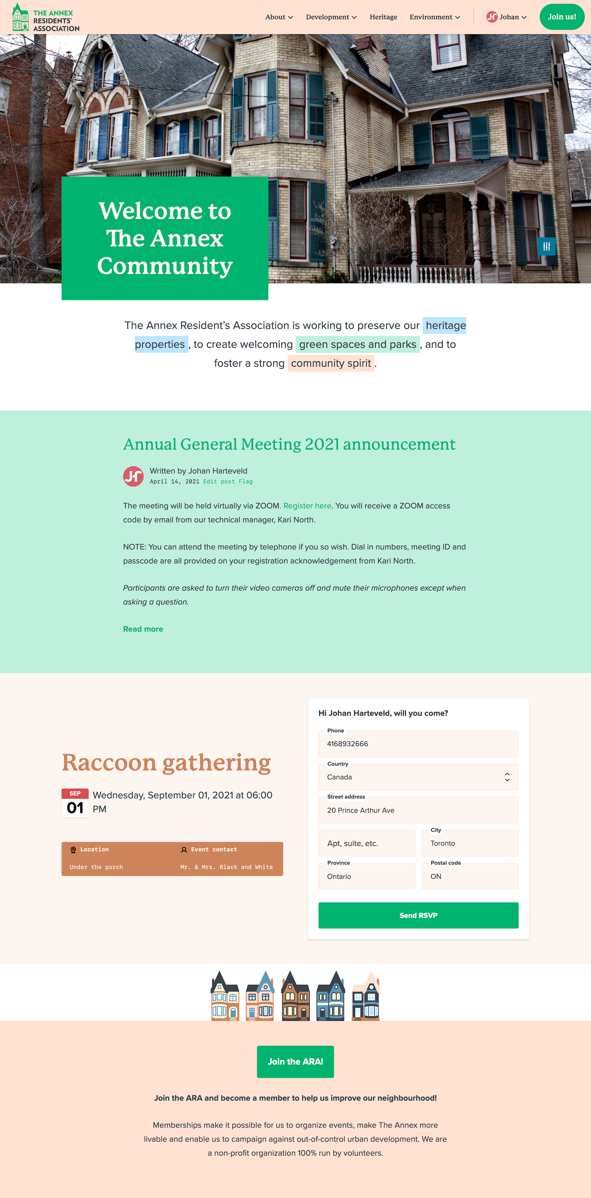
Website homepage mockup

